How We Designed
1. Hypothesizing
If we make Policy Manager’s self-service features more visible and clearly differentiate them through color and hierarchy, users will better understand what actions they can take and be more likely to complete them independently🎉
2. Ideating
Policy Manager Home Page
The original Policy Manager homepage served only as a static repository for existing policies and unfinished quotes, leaving users unaware of key self-service features like policy renewal, claims submission, and self cancellation.
My Design Decision(s):
• Transformed homepage into self-service hub with directional buttons instantly communicating available actions.
• Switched "My Quotes" and "My Policies" link because more users visit Policy Manager to sort their policies.
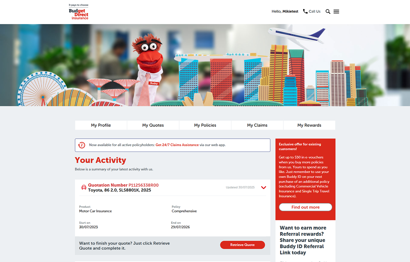
Before
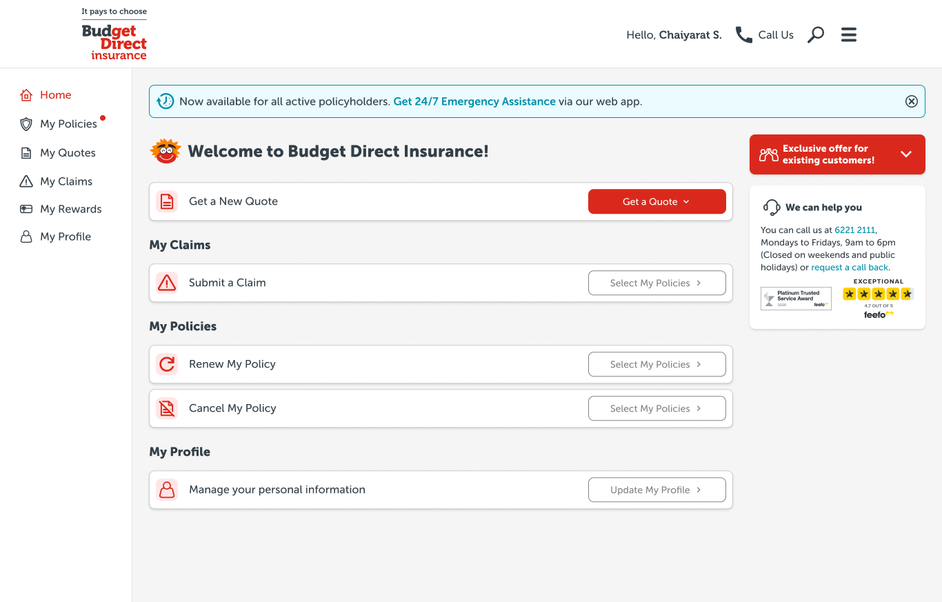
After
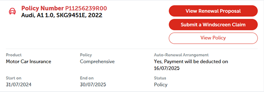
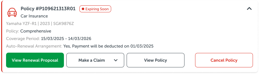
Renewal First
The old My Policies page overwhelmed users with all buttons in the same red brand color which lacked hierarchy. There was also zero policy status visibility, so customers are not aware that they can renew their policy.
My Design Decision(s):
• Established clear color-coded hierarchy to possible actions for each policy.
• Added status tags (Active/ Expiring Soon/Expired) with expiring policies pushed to the top for instant policy awareness.
• Added tabs to sort policies by status and product type.
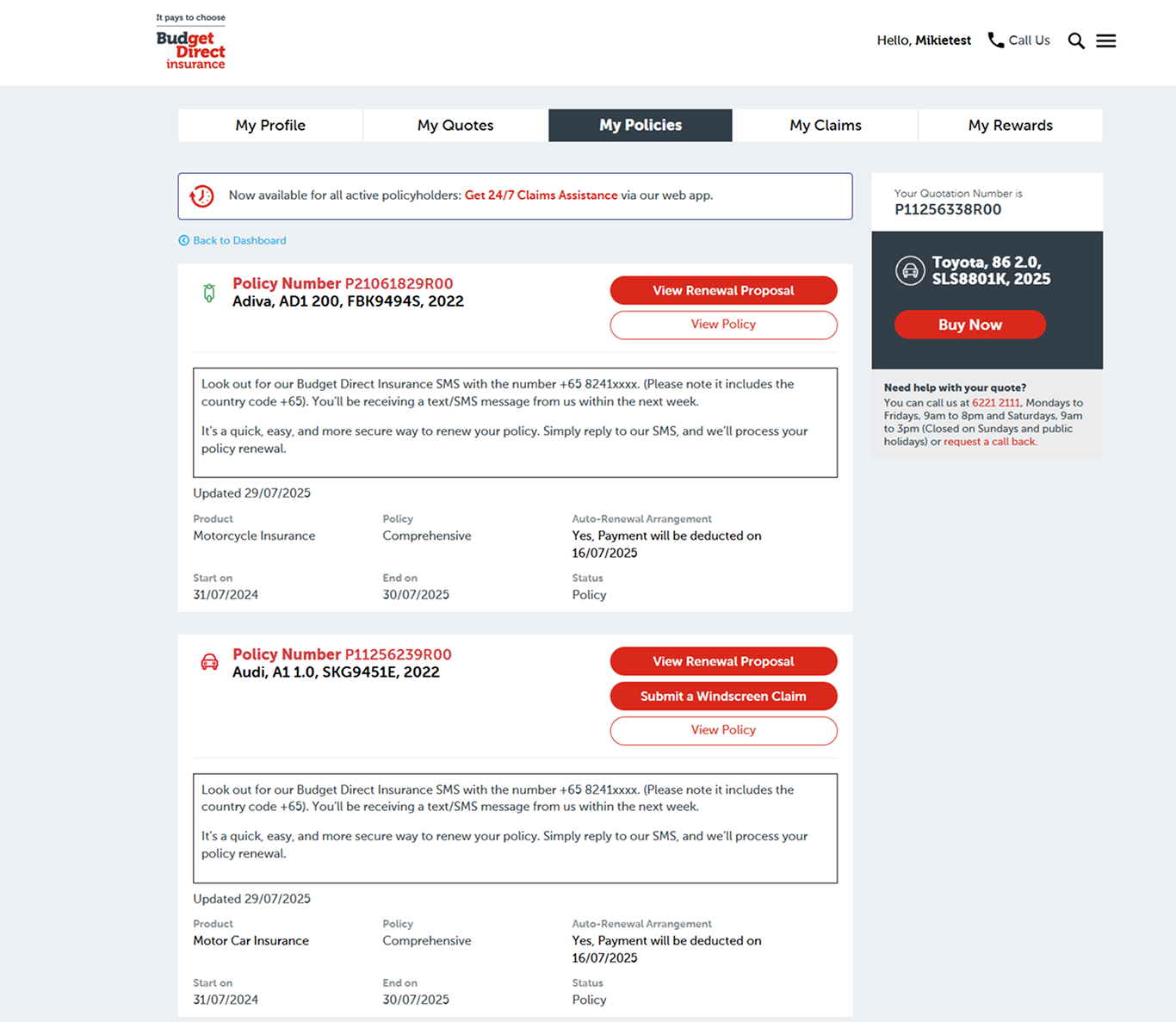
Before
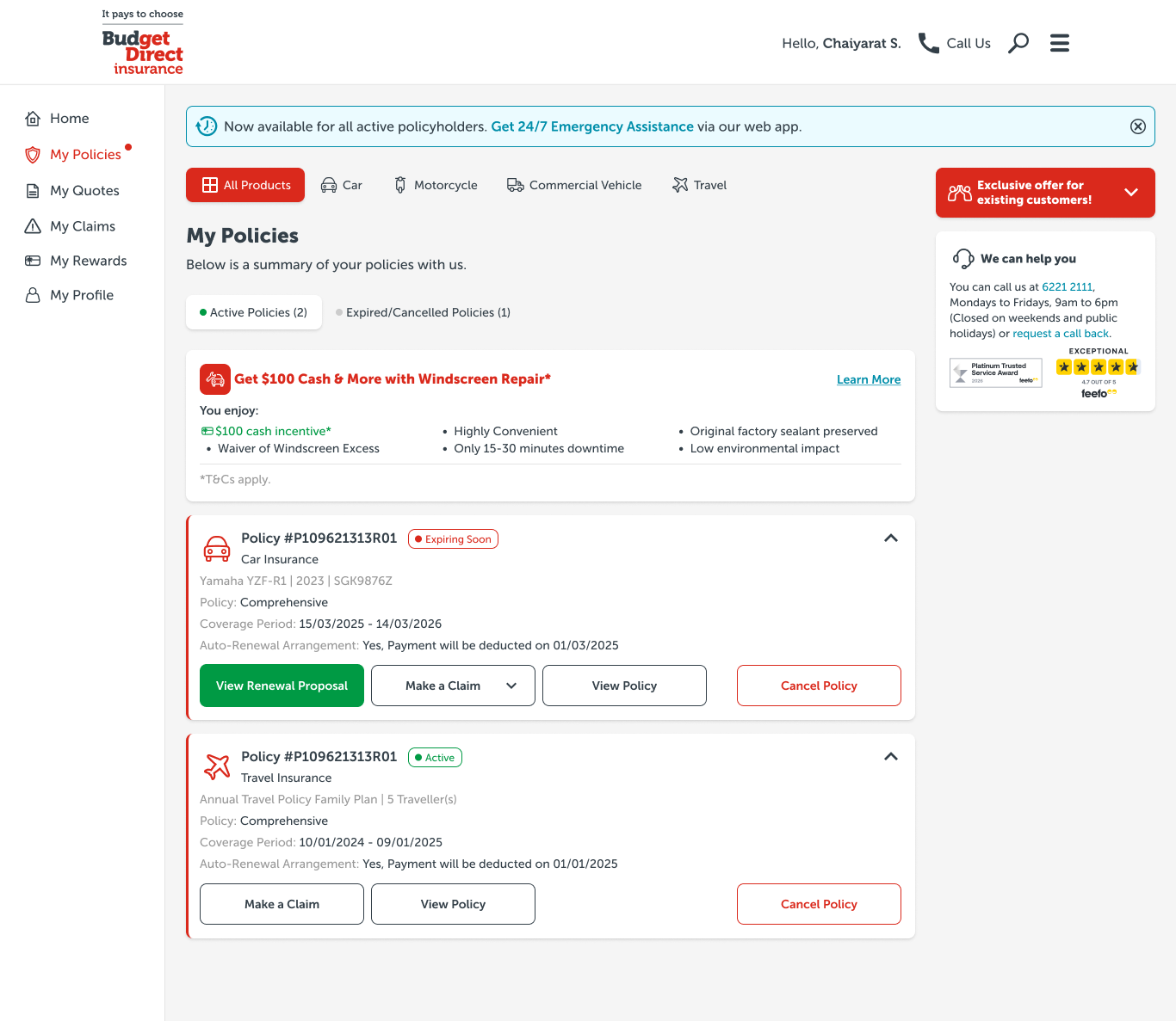
After
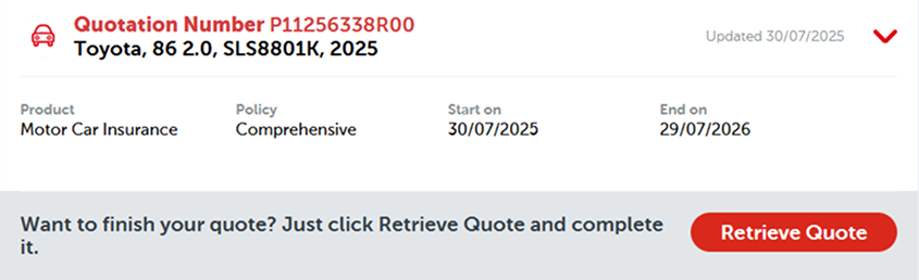
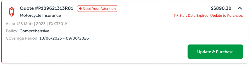
Quote Completion
The Quote component in production lacked visibility on what has to be done for customers to purchase the policy. There was no urgency for customers to complete their quotes as well, which led to quotes being forgotten and expired.
My Design Decision(s):
• Added prominent visual cues "Start Date Expired. Update to Purchase." to better inform users what they have to do to purchase the policy.
• Added status tag (Need Your Attention) to create urgency and prioritize incomplete quotes.
• Green "Purchase" CTA to evoke trust and forward momentum.
Before
Bonus New Feature: Self Cancellation
Previously, customers had no self-cancellation feature, so they were forced to dial customer service for policy cancellations, creating unnecessary support workload. I had to work on this project alongside the Policy Manager revamp.
Content Decision: NEW FEATURE prioritized by Business and Sales Team to give users better policy control.
My Design Decision(s):
• Made button red and secondary = to push it down the hierarchy + critical action
• Always-visible consequences = fee preview modal before confirm, disclaimers for outstanding claims
• Extra step process = deliberate friction to prevent impulse cancellations
Before
After
3. AI Assisted Prototyping
In this age of AI, we leveraged Figma Make to handle complex logic like error messages and edge cases (empty states, no expiring policies); details designers often miss under time pressure. Here's the step-by-step:
Step 1: Journey Flow Prompt
Entered the full user journey into Figma Make to generate quick iterations of the Policy Manager flow, which automatically covered edge cases and animations which was used as reference by our developers.
Step 2: Embed Core UX Ideas
We injected our human ideation (green CTA + self-service hub concept etc) directly into Figma Make, ensuring the UX output aligned with our hypothesis and ideas rather than generic designs.
Step 3: Stakeholder Validation
With multiple variants provided by Figma Make, we selected ones that align with our vision as proof of concept, quickly validating it with our stakeholders who gave us their feedback, which we would then incorporate in and take note of for the actual mock-ups.
Disclaimer: AI assists with ideas but will never replace UI/UX ownership.
4. User Testing
With the prototype in hand, we conducted testing internally and with a small group of users.
Task 1: "What can you do here?"
Task 2: "Your car policy is expiring soon. Renew it."
Task 3: "You have gotten into a car accident. File a windscreen claim."
Task 4: "You have changed your mind about your car policy. Cancel it."
Besides assigning them tasks, we also asked them questions to understand their pain points and to scope out future quality of life improvements for the Policy Manager.
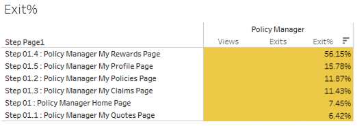
Key Findings:
• 100% awareness of all features offered on the portal through Home page
• Users successfully located the expiring policy to renew their policy
• 75% of users locate windscreen claim button through product tabs on My Policies page.
With that, our hypothesis was validated. Thank you to our Business, Sales & Marketing team + our customers for willing to do the test to provide us with more insights😊
5. Iterate + Fine Tune
With user testing success confirmed and prototype approved, we created high-fidelity mock-ups to polish the UI, fixing AI-generated issues while scaling to responsiveness and production readiness.
The final mock-ups were finally ready, and development began ✅
Home Page
Production (Before)
Mock-up (After)
"My Policies" Page
Production (Before)
Mock-up (After)
"View Policy" Page
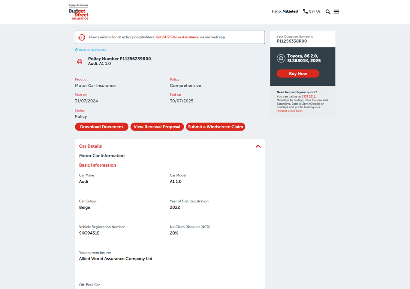
Production (Before)
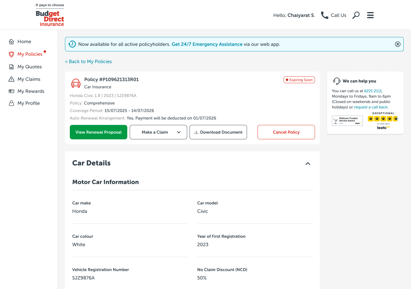
Mock-up (After)
"My Quotes" Page
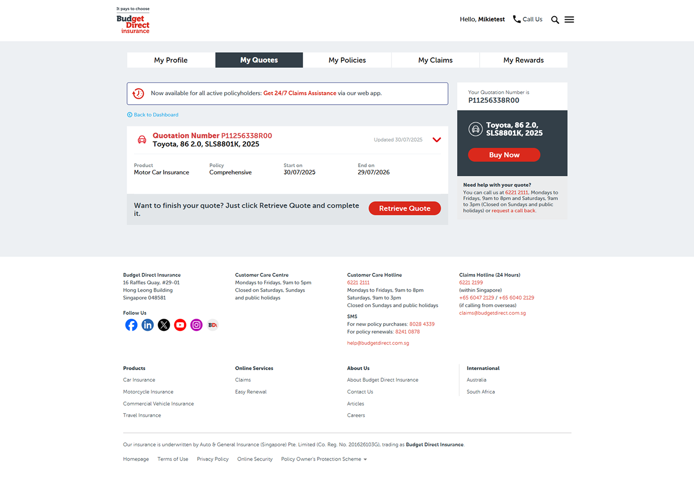
Production (Before)
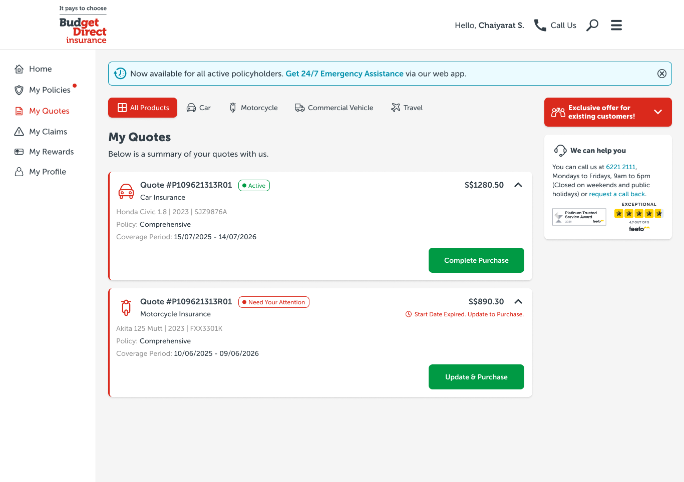
Mock-up (After)
"My Profile Page
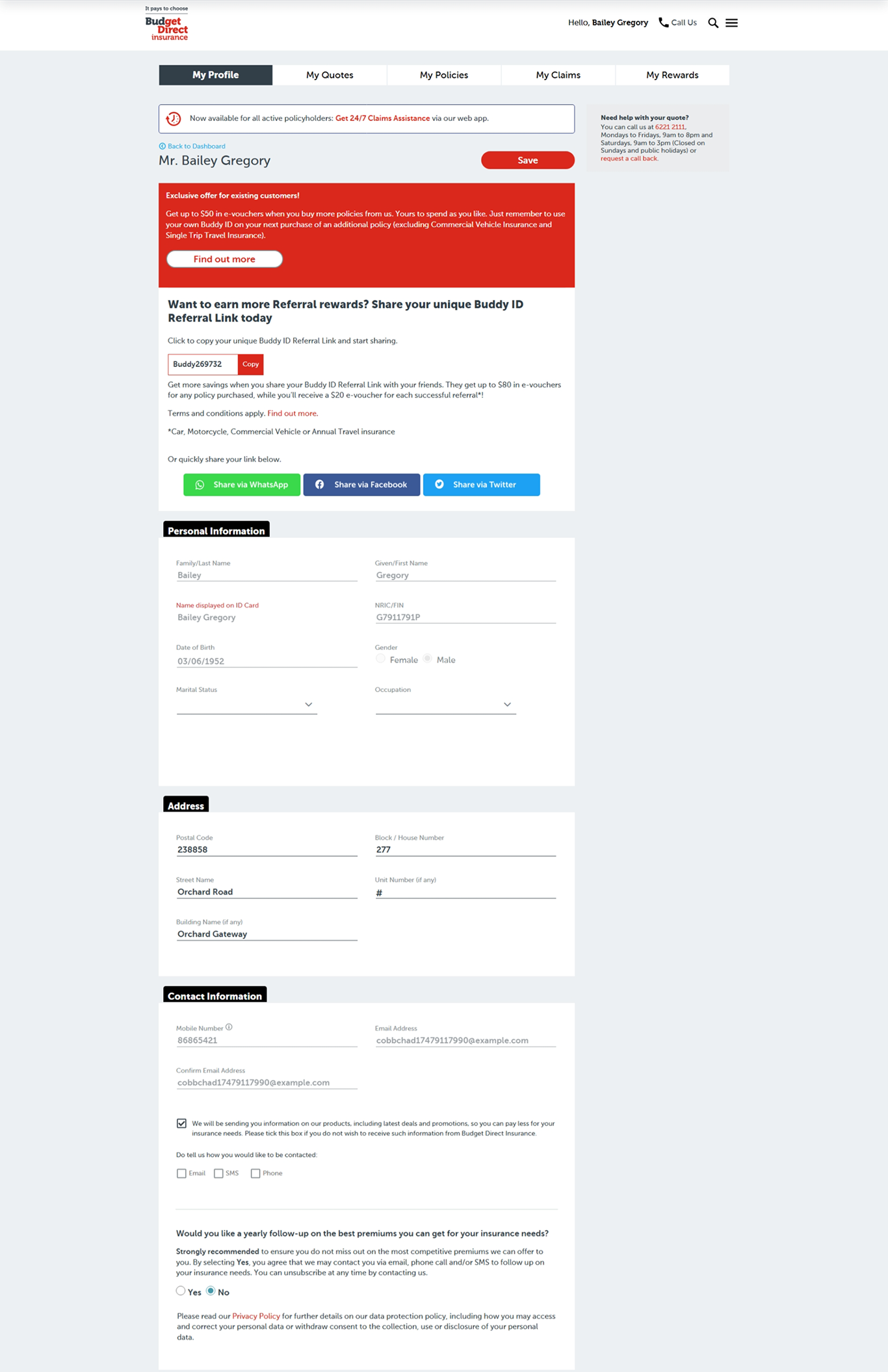
Production (Before)
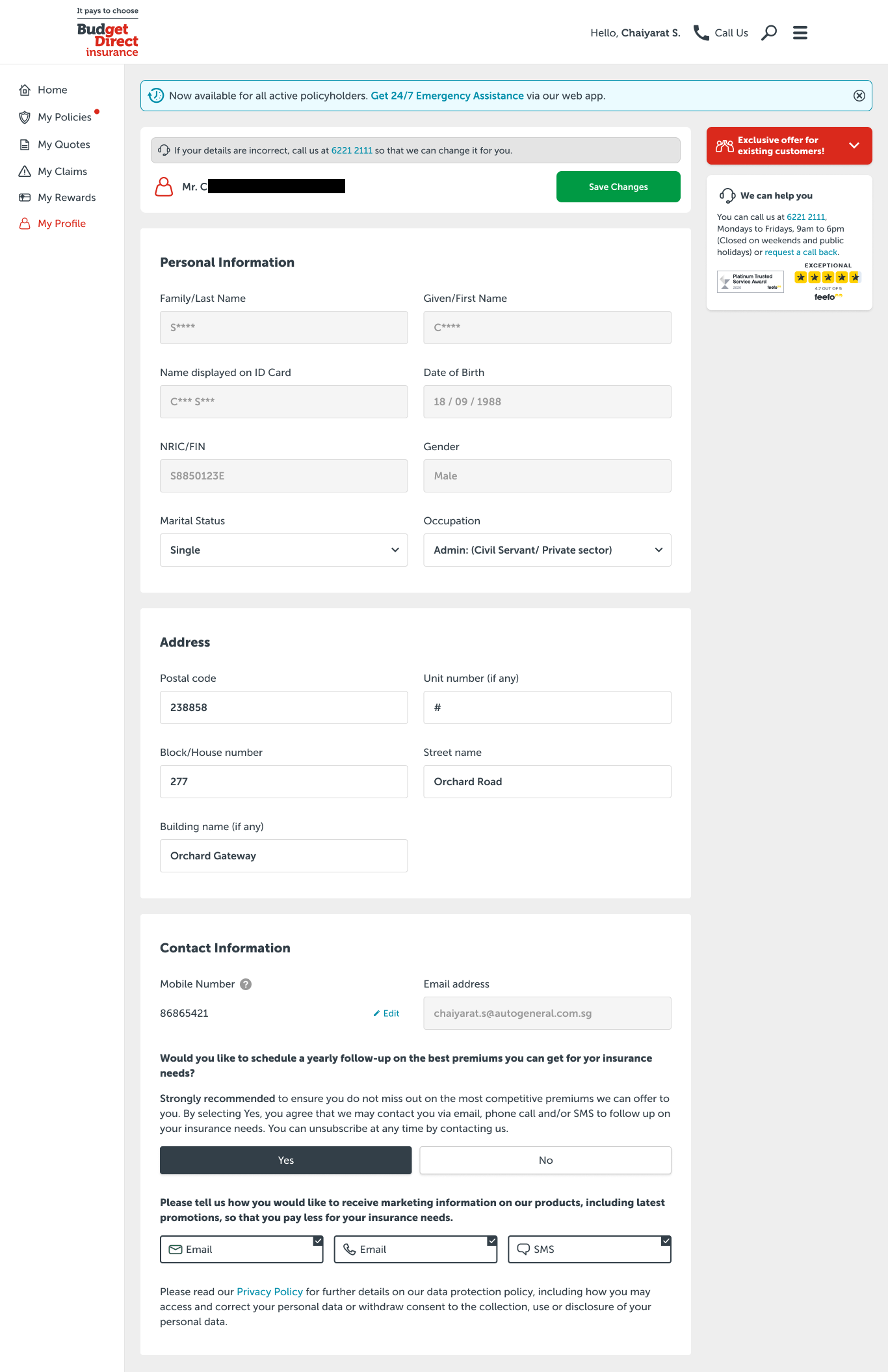
Mock-up (After)


.png)
